
Agile Metrics From Agile Project Tools
Table of Contents
Let’s continue our journey through agile metrics. And from this part we will dive directly into them following order that was set in previous part. And we will start from the metrics related to Agile Project Tools.
Velocity

This is the first metric that is looked at when talking about agile metrics. It is the most commonly used and overrated. And to help you understand why you may use it wrong answer on the question “How do you calculate velocity?”.
It is true, that velocity is the easiest metric to calculate. At the end of the sprint, add up the sum of scores of the stories that are in the Done stage (based on your definition of ready) within the sprint. But to calculate it right you should keep in mind:
- It matters when a story ended, not when it began. A story that started in
sprint 11and ended insprint 12contributes full points tosprint 12velocity, but none tosprint 11. Ideally, all of your stories should be finished during the one sprintm but it is still important to follow this rule, because real projects far away from ideal. - Points are calculated for the sprint in which story is completed, not handed over to the client. A stakeholder or team may decide first to leave the work and not hand it over to the client for a few weeks or even months (although this is completely wrong). However, points should be tracked immediately, because velocity is a measurement of how much work a team can complete in a given period of time, not how often software is released to clients.
What is velocity and what is not
Velocity is not a measure of efficiency, effectiveness, competence, or anything else. It is simply - the speed at which a given number of stories are turned into the tested and ready for use software. There are hundreds or thousands of reasons why a team might have a certain velocity in a sprint and 99% of them have nothing to do with the qualifications or expirience of team members. Velocity should never be used to track team’s ‘perfomance’.
This metric has only one purpose: to give the team a benchmark for estimating and planning how much work they can accomplish in a given period of time. If someone outside the team asks what the team’s work rate, ask why they want this information. If the answer is that they want to compare efficiency of all teams in the company, then don’t tell them anything (and start looking for a new job). If the answer is that they want to know when some work will be completed, then tell them when you think it will be completed (they don’t need to know your team’s velocity metric for that at all).
Another thing you need to know about velocity - it has nothing to do with quality (which is very important) or value (which is even more important, and has nothing to do with quality). Software quality - the extent to which it meets the expctations of the people who developed it - the extent to which it meets functional and non-functional tests, benchmarks and acceptance criteria it is described by. Value - the extent to which it enriches the lives of the people who use it. Rate is not based on any of these: it is simply how much ‘material’ has been moved from one column to another. ‘Material’ may not be high quality (although if you have at least half decent tests and acceptance criteria, it should be pretty high quality), and it may have poor or no value at all (as evidence, look how much software we have today).
There are two other reasons why you shouldn’t use velocity to evaluate team perfomance. First, the team can fudge the velocity by constantly raising their scores (and no one can stop them from doing this, as the team determines the scores themselves). Second, the resulting numbers are an estimate of difficulty, not value. I’d rather be in a team that makes 10 points of quality valuable software per sprint, than in a team that has 50 points of rubbish software that nobody needs.
How to use velocity
I usually use the average velocity over the three sprints, specifically taking the average of the last three completed sprints and using as an estimate of the team’s velocity in the future sprints. This allows me and team predict how much they can do over the next few sprints. Keep in mind that due to changes in the team, work environment, product design, etc., the velocity can change constantly. So you cannot use your current average velocity for more than a few sprints ahead. The velocity metric can also be an input to a work burn-in chart or a release work burn-in chart to visualise progress towards a release milestone.
In some cases, velocity is not actuall needed for planning. If the only reason you are giving estimates to stories is so that you can use velocity to do forward planning, consider dropping estimates and switch to use more usable metric then you can get from the stories completion.
Velocity variance and the standard deviation

Ideally, teams should exhibit a fairly constant velocity with a gradually increasing slope. Significant velocity gaps and jumps are a bad sign. You can check this by looking at the change in velocity. The proper statistical way to do this is to calculate and average over the last six completed sprints (while six is the ideal number for this task, the right minimum with which you can do this is four, and the lowest point is three). Then take the difference between velocity of each sprint and the average, and square it (so that all the numbers will be positive). Add up the squared difference - this will give you the variance. Divide the variance by the number of differences - this will give you the standard deviation. You can also use the square root of the variance as the deviation to equalise the power up.
Example
Let’s take a team whose averge velocity is 30 points. For the last four sprints their velocity was: 25, 35, 40, 30, 30 and 20. Now we will calculate the difference, squares of differences, variance and deviation:
Sprint 1:

Difference: 30-25 = 5
Square = 25
-----------
Sprint 2:

Difference: 30-35 = -5
Square = 25
-----------
Sprint 3:

Difference: 30-40 = -10
Square = 100
-----------
Sprint 4:

Difference: 30-30 = 0
Square = 0
-----------
Sprint 5:

Difference: 30-30 = 0
Square = 0
-----------
Sprint 6:

Difference: 30-20 = 10
Square = 100
-----------

Dispersion: 25 + 25 + 100 + 100 + 0 + 0 = 250
Standard deviation: 250 / 6 = 41.66(7)
Standard deviation (sqrt): 6.45
These are pretty big numbers for a team with average velocity of 30, and it indicates that the team should consider how to achieve a more stable velocity. But don’t forget that the velocity score depends on the context of the project and the tasks being performed during sprint. If you get similar values with the same context, etc., there is no need in discussion of how to get more stable velocity. If you want to learn more about variance and standard deviations, you can go to a lot of resources that covers how to use statistics in real life.
Velocity predictability

Another interesting metric is degree to which the velocity matches the team’s planned velocity. For example, a team may plan a sprint with 24 Story Pointsm but then execute 28 (or 20). This is interesting data, especially if it becomes a pattern. Ideally, the team should be running at a predictable sustainable pace. Make sure data like this is not used as a vector of attacking the team for a poor perfomance. There are many factors that can affect a team’s score (and velocity) and mane of them are external.
How to measure predictability
To measure this, simply take the difference between scheduled and completed Story Points. You can also use this figure as a proportion of the final points to cater for teams with unusually high or low rates in general. To do this, convert the resulting number to a percentage; divide the difference between planned and completed points, divide by the rate, and multiply by 100.
Example: a team plans 30 points for a sprint and completes 27. We got 3 points less or a percentage of 10% (3/30 _ 100*). In the next sprint, they planned 32 points and executed 34. They were ahead by 2 points or a percentage of 6.25% (*2/32 _ 100). Make sure these numbers stay within the team: they shouldn’t just be reported to the management.
Recidivism
This metric is the ratio of user stories that go back into development. This is usually due to failing some QA tests (but can also be for other reasons, such as a change in requirements). You can calculate it by taking the total number of completed user stories in the sprint that re-entered and dividing them by the total number of completed stories. If a story has gone back into development more than once, you can still count it as once (but this is not very good practice). Certainly you’ll want the number of recurrences to me minimal, and ideally - 0. If the rate is higher than 10% or 20%, this should be a serious concern, as it indicates a quality problem (it could be code quality, requirements quality, perhaps even data quality or the environment in which the work being done; so don’t go straight to the developers with questions - try to get to the root of the cause).
First-time pass rate

This metric is very similar to recidivism. It is the percentage of test cases that were passed the first time they were run. Take the number of the test cases passed the first time and divide them by the total number of tests run. You can take this metric per sprint or release, and each metric should be treated as a separate metric. This metric is typically used to measure test case progression. That is, you have a new feature that works, but you want to test it with regression tests, testing old features to make sure nothing is broken. If you do this, you should have separate metrics for regression and progression tests, because each of this metric tells a different story. Ideally, the percentage of tests passing the first time should be close to 100% - even teams wothout extensive automatation should have a reasonable quality level set. If it’s below 90%, there is a quality problem (although, again, you need to find the part of process that’s causing the problem, rather than attacking people). If you implement reasonable test automatation, it should be fairly easy to get close to 100%.
If you don’t use test cases, you can base it on user stories. In this case, take the number of completed user stories that passed the QA, ST, or SIT state tests by the first time and divide them by the total number of completed stories for that period. You can do this separately by sprint or release. User stories can only be applied to progression testing - do not create user stories for regression tests. This is an anti-pattern (user stories represents additional work to build a product, not re-testing that product).
Defect count by sprint
This simply metric allows you to see how many defects you have in each sprint. You calculate it by adding the number of defects that were created during the sprint. If a defect was created twice for some reason (which shouldn’t happen), count it once. If it was closed in another sprint (which shouldn’t happen either), don’t worry about it. This metric is simply the number of defects created. It is a number that should ideally decrease to zero, or very close to it, as the release approaches.
Defect count by story count
This metric is likely to be more useful that the previous one. It is calculated as the ratio of the previous number (defects created during the sprint) to the total number of user stories in the sprint. The problem with using a fixed number, such as the number of defects per sprint, is that it doesn’t take into account how many stories were in the sprint. This can vary greatly depending on the experience and size of the team, project context, number of current defects, technical debt, etc. Two defects identified in a sprint with two stories is very different from two defects identified in a sprint with 20 stories (using this metric we get 100% vs 10%). To calculate this metric, divide the number of defects created in a sprint (the previous metric) by the number of stories in the sprint. I would recommend to calculate this using stories that were in development or later at the time the sprint was completed. Don’t forget to include closed defects and closed stories as well.
Example: suppose you have two open defects and three closed defects at the end of the sprint. Two closed defects that were created two sprints ago and closed only now. You have two user stories in backlog, six in development, two in QA, two in progress, two in done. Let’s start by counting the defects that occured in this sprint: there are three (two open and one closed, since the two closed ones were created in previous sprint and are not counted). Then we add up the stories, at least those that are at least in progress - that’s 10 (6+2+2). Thus the ration of the number of the defects to the number of the stories is 0.3.
Story completion ratio
This is simply the number of stories completed in the sprint compared to the recorded number at the start. So if a team puts ten stories into a sprint and completes seven, the completion ratio is 70%. This rate should be high enough - stories should be small enough to be completed in one iteration. Be sure to include stories carried over from previous sprints to count the number of completed stories recorded. This is actually part og sprint goal or commitment. Don’t forget to include stories that were deferred during the sprint or placed back in the queue. Ignoring them will certainly improve the score, but will hide the real picture.
Story point completion ratio

This metric is similar to the previous one, but is calculated using story points rather than number of stories. Whilst not everyone (me in particular) likes to evaluate stories in points this metric is more useful than the previous one as it better reflects the situation. Let’s imagine that a team takes on 10 stories, two stories got 1 point each, and remaining eight got 13. Suppose the team fails to complete two stories which together got 2 points. According to the previous metric, we get 20% of the work that was not completed. But if we look at the result of this metric, only 2% of the total work was not completed.
How to use this metric
This metric gives an indication of how good your team is at predicting their capabilities and how well them at sprint planning. Ideally, the team should make reasonable and stable commitments in each sprint and execute most or all of what was laid out for the sprint. If there are large gaps, this indicates a number of possible problems. The team may be underestimating the scope of the story. The team may have been forced to do more work than they planned (this is most important red flag; the team needs to feel confident that they are free to choose the goals and commitments of the sprint). Or the team may have made a reasonable forecast, but during sprint encounter an obstacle they couldn’t foresee and it reduces their speed of getting job done.
How not to use it
Like I said earlier, deal with the problem, not the person. Use the principle of ‘five whys’, in order to analyse the root cause and identify corrective actions or ways to improve. Make sure this metric doesn’t go outside the team without their consent or a good reason.
Blocked time by work item
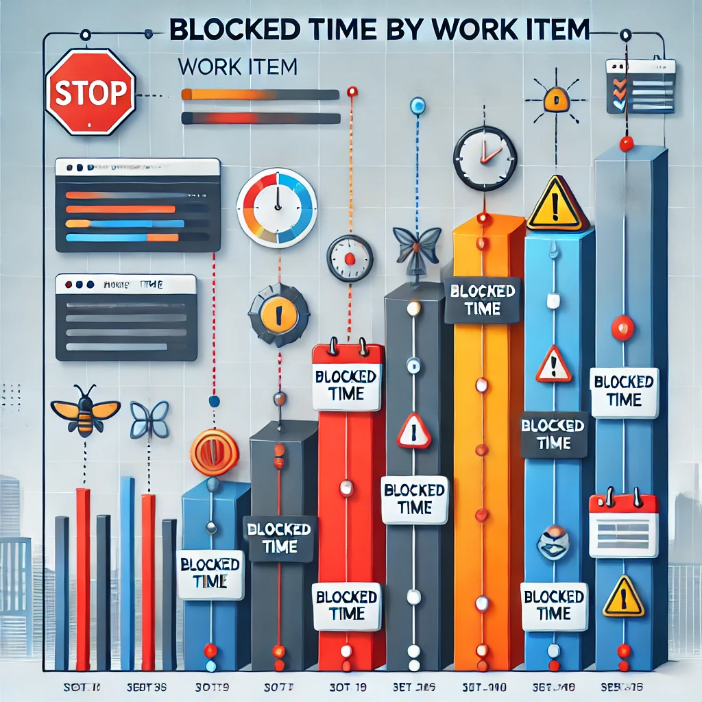
This and next metric describe the impact and duration of obstacles during the task completion. To calculate how long each work item has been blocked, you first need to start tracking blockers (sometimes called obstacles) in your project management tool. Most modern agile project tools allow you to mark stories or tasks as ‘blocked’ and also include some form of auditing or reporting on the amount of time an item has been blocked. If you are tracking blockers, at the end of the sprint, simply add up all the time that any story or task in the sprint has been in a blocked state.
Do this for any object in the sprint (that is, anything that the spent any time in any workflow state in the sprintm including uncommitted sprint work, but not things in uncommited product work). Then divide that time by the total number of entities that counted as candidates for that metric. So, if you had 20 stories in sprint, and there were a total of 12 hours that some of the stories were in blocked state, then we get that strories in average would be blocked for 36 minutes (12 hours is 720 minutes, dividing this by 20 gives us 36).
How to use the metric
This number shows how much in average blocking affects elements of the workflow. You should aim for this number to be minimal and trending downwards. Anything over 1 hour indicates a large blockage.
How not to use it
Don’t use this indicator to criticise the team or look for a scapegoat. This metric should be used by the team to assess how much blockage is affecting their ability to get the job done. Keep in mind that many of the team’s obstacles are external, so don’t let management use this metric to attack team members and evaluate their perfomance. Obstacles are often the result of the inefficient artefacts arising from value creation, e.g. sign-offs, approvals, hand-offs, etc.
Percent of items blocked
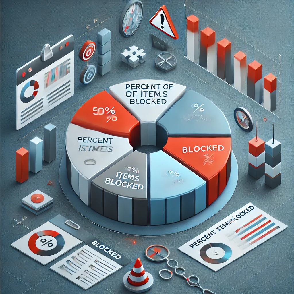
This metric is similar to the previous one, but measures what percentage of user stories in a sprint are blocked by obstacles. It won’t tell you how long the blocking lasts, but it will tell you the percentage of blocked stories out of the total number of stories, which can be useful. If you use a report on the blocking time of each item, your numbers may be skewed, as one story blocked for a long time ‘blows up’ the average, which is extremely low without it. You can exclude outliers or use this metric instead. It is calculated very simply - count how many stories were blocked during the sprint (assuming they made it to the sprint backlog, we are not talking about counting or blocking in the product backlog). Then divide this resulting number by the total number of stories that were in any progress during the sprint. This will give you the percentage of blocked items.
How to use it
You can use this metric to determine the frequency of obstacles in your team. You should aim to keep this figure low, ideally at 10% or lower. As with the previous one make sure to investigate possible root causes of problems and ideas to improve the process rather than bashing team members. Blockages and obstacles often come from factors outside of the team’s control (otherwise they would have been eliminated immediately).
Cumulative flow diagram
What is this metric about
Cumulative Flow Diagram (CFD) - is not really a metric, but a visualisation of a set of underlying metrics. Specifically, a CFD is a cumulative line chart showing the total scores of stories in different states. This chart is difficult to describe verbally, so it will be easier to give a visual example. Below is the cumulative flow diagram for a team. The horizontal axis is time, the vertical axis is strories in a certain state according to points. The colours represents the states in which the stories are in.
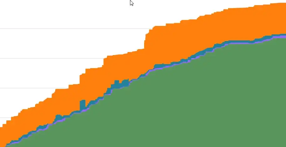
In this diagram, green is completed stories, light purple is Review, blue is In Progress, and orange is not yet commited.
At any time you can draw a straight diagonal line and see the proportion of work in different states. The fact that you can see all the states and their changes over time makes this tool very powerful, but also complex. It is much more complex than the better known and more popular charts such as burnout chart (which are pretty bad at showing work).
The example shows a pretty good cumulative flow chart because the backlog was never too large (we want to advance right before incomplete stories, after all), strories are consistently completed, and most importantly, there is a small amount of work in check and in progress (i.e. incomplete stories that are under control).
Posts in this series
- Agile Metrics From Business Intelligence Tools
- Agile Metrics From CI/CD
- Agile Metrics From Version Control System
- Agile Metrics From Lean Kanban
- Agile Metrics From Agile Project Tools
- Agile Metrics Principles